Sketch: Web App Systems
Bringing the infinite canvas to the browser with Web Workers and Microfrontends.
Roles: Core Team, Frontend Engineering, Design System Top Tech: React, Microfrontends, Web Workers, Canvas Rendering
At Sketch, the goal was ambitious: take a native macOS powerhouse and make it feel just as premium, responsive, and powerful in a web browser. I was part of the Core Team that turned this vision into reality, focusing on the technology that powered the main Web App.
I was extremely proud to work there. We used cutting-edge technology to solve hard problems, and the features we built were used by hundreds of thousands of designers every day.
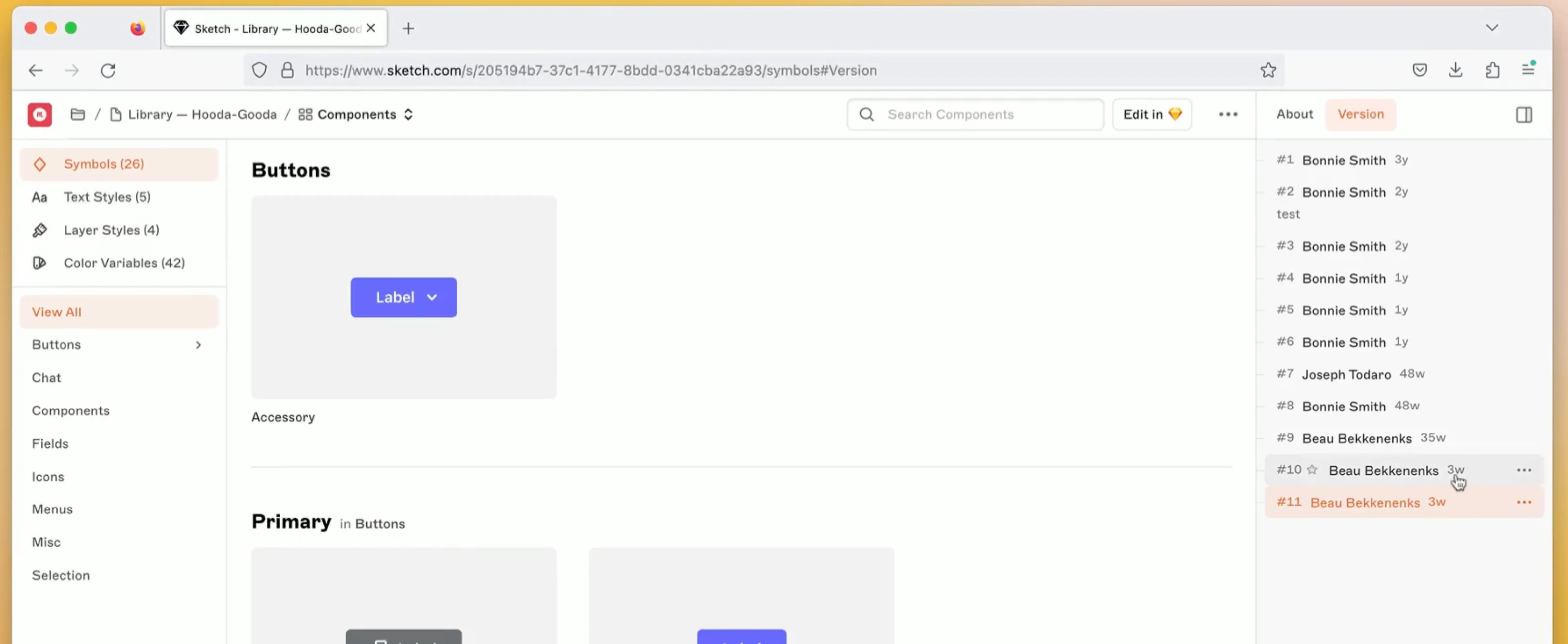
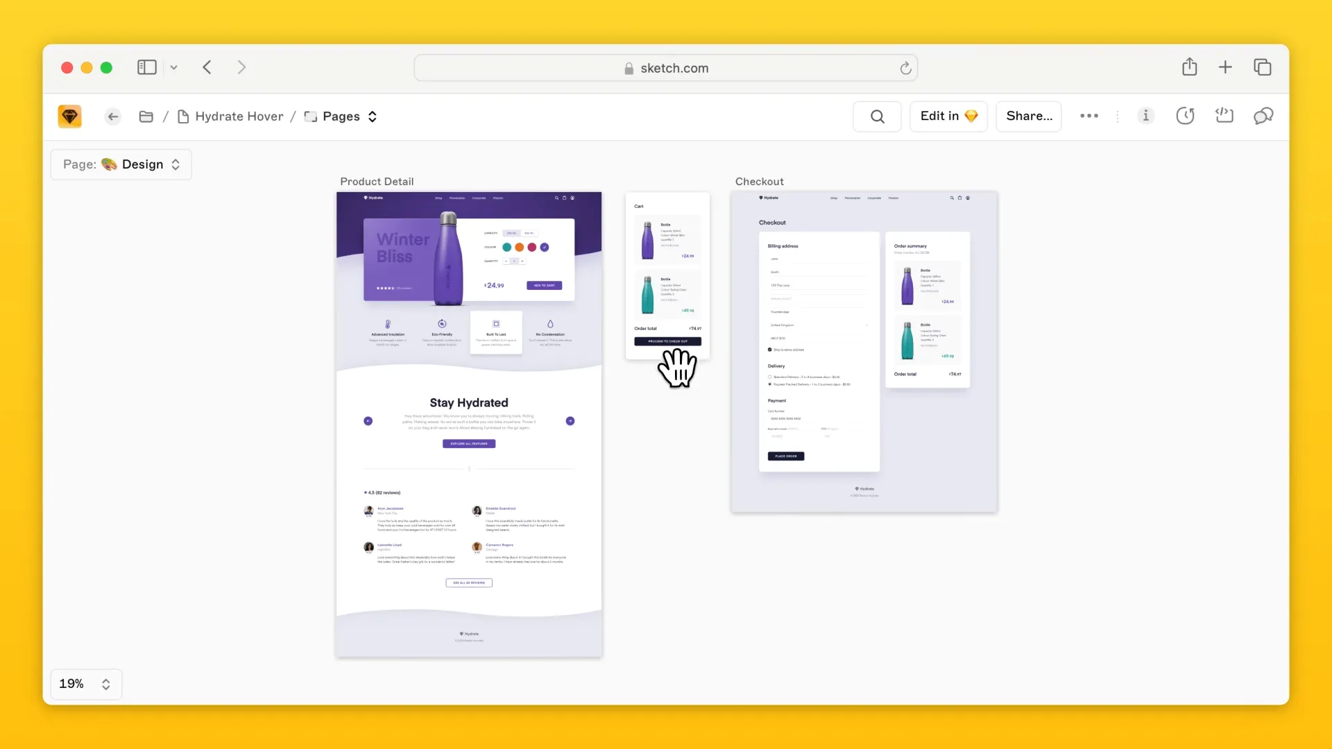
The Crown Jewel: Canvas View
One of my favorite features to work on was the Canvas View. This wasn’t just an image viewer; it was an infinite canvas that rendered Sketch documents directly in the browser.
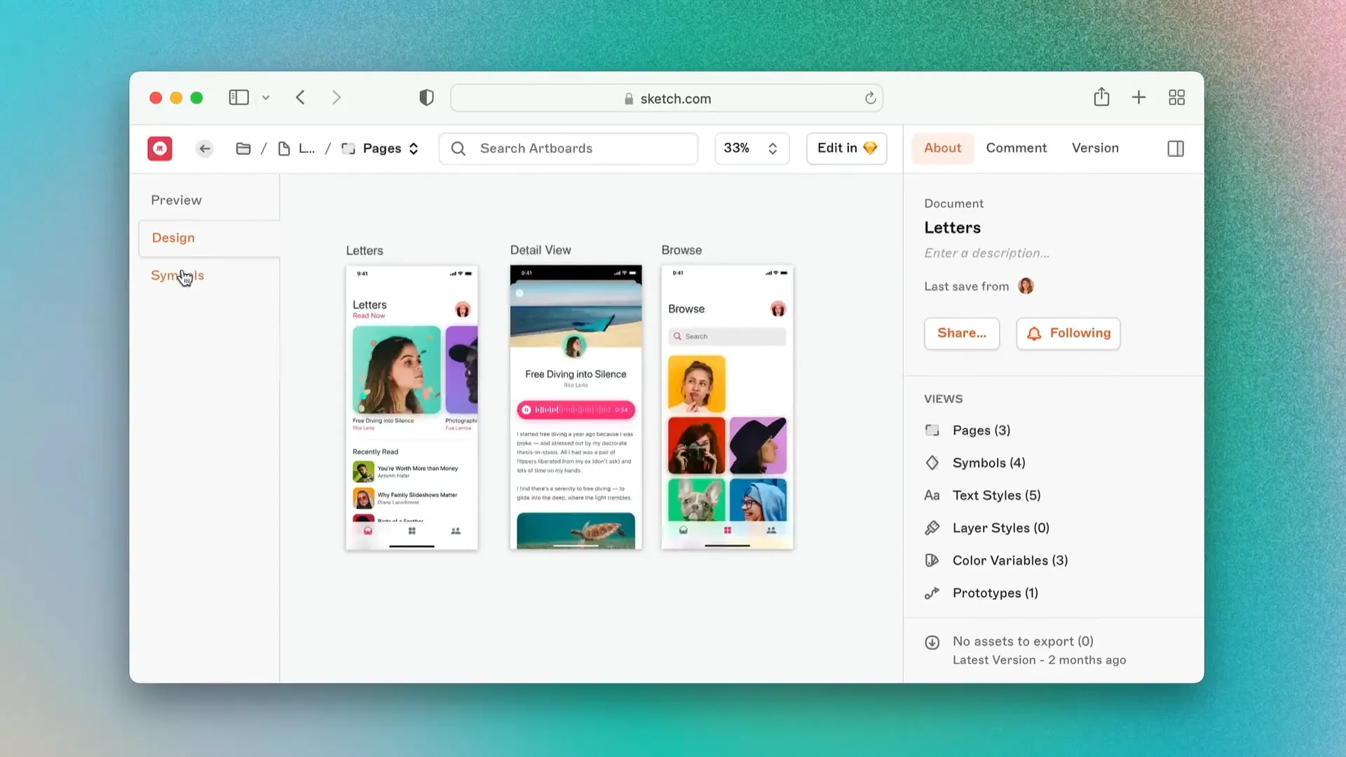
I worked across multiple layers of this feature. While the rendering engine did the heavy lifting of displaying the artboards, I built the critical UI systems that wrapped around it:
- The Sidebar for seamless page navigation.
- The About Tab for document metadata.
- The Comments and Version History interfaces overlays.
What started as a simple static viewer evolved into a rich, interactive experience. We enabled Inspect on the canvas, allowing developers to click any element and get code snippets, and even added Prototyping interactions right in the browser UI 1.
Breaking the Monolith: Transitioning to Microfrontends
As the web app grew, so did our bundle size. Loading the massive main app often resulted in a heavy JavaScript payload that slowed down initial render times. While manageable for desktop users on fiber, we wanted to ensure quality and speed for everyone.
To solve this, we broke the monolith.
We architected a transition to Microfrontends, splitting the application into distinct “mini-apps.” This required defining a strict hierarchy of 6 distinctive layers to organize our packages.
- Refactoring: We ruthlessly removed circular dependencies to keep components self-contained.
- Tooling: We built custom tools to prevent future architectural grouping, ensuring one mini-app didn’t accidentally import heavy packages from another.
- Performance: We introduced Web Workers to cache multiple assets in the background, significantly smoothing out the loading experience.
Scaling the Design System: “Prism” & The v100 Facelift
In 2019, we needed to modernize our UI. I collaborated on implementing our new Design System, codenamed Prism. The speed of execution was impressive—in just two months, we successfully ported 80% of our components.
This laid the groundwork for the major Web App Facelift we shipped with Version 100. We redesigned the Canvas view, Notifications, Files, and Documents to feel more cohesive with the Mac app. The goal was to let the content shine, removing the clutter of endless sidebars and tabs 2.
We also implemented Dark Mode across the entire web app. I led the effort to ensure our dark theme wasn’t just an inversion, but a carefully crafted aesthetic that matched the native macOS experience perfectly. Now, working at night has never been more stylish! 3
Bridging the Gap: Color Tokens
Finally, I worked on Color Tokens, a feature that bridged the gap between Design and Engineering.
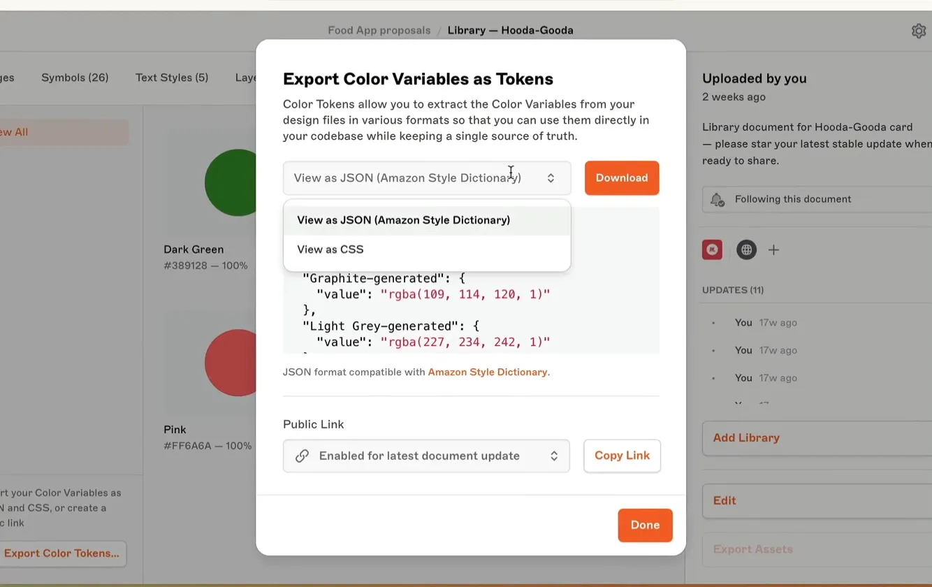
We allowed users to export their Design System color palette directly to JSON and CSS. This meant teams could integrate Sketch directly into their CI/CD pipelines. A change in Sketch could automatically push updates to iOS, Android, and Web apps, ensuring the design language stayed consistent and always up to date 4.